you'd think, that since i've had so much time to work on the kitchen layout, i would have had this figured out a long time ago. not so much...
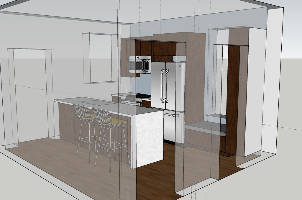
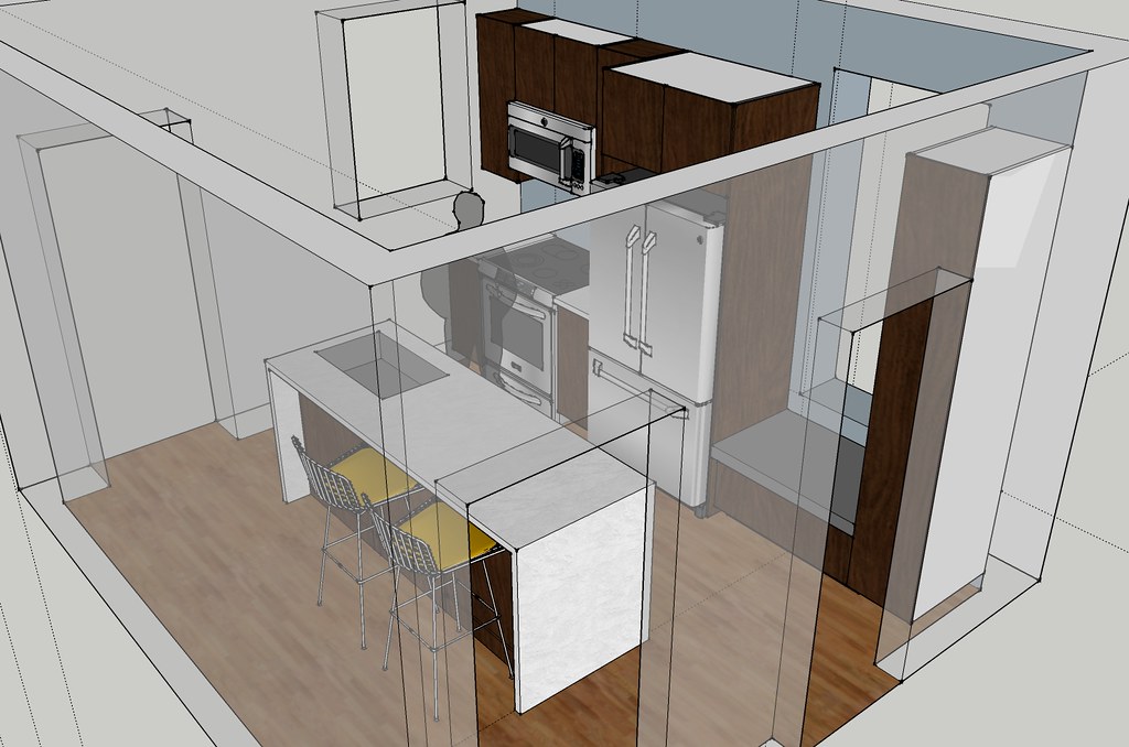
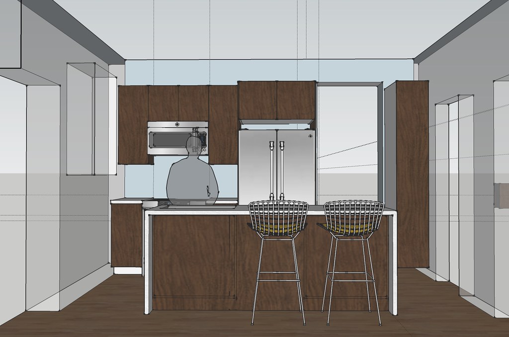
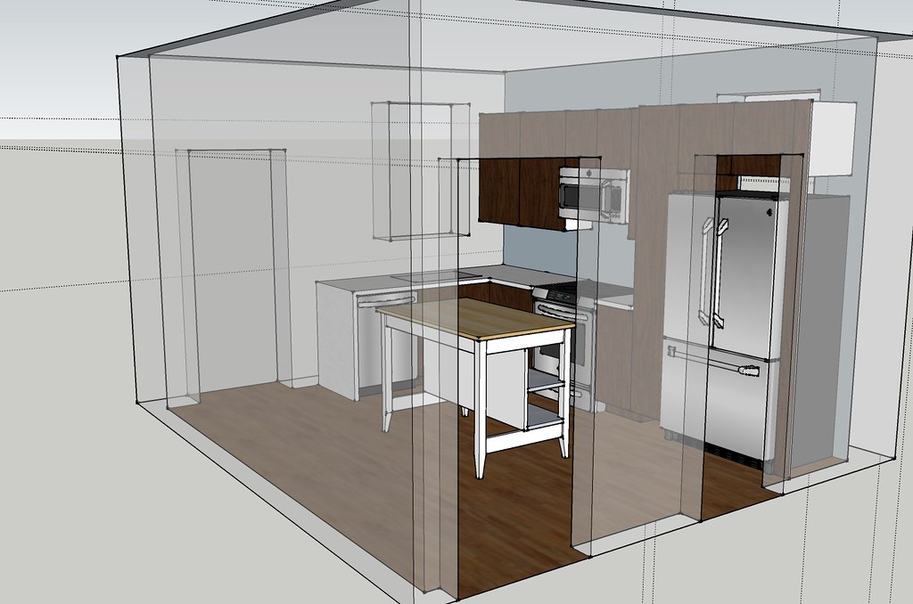
in order to see how i finally came to the final design, i thought it would be interesting to see some of the process. and sadly this is only a small portion of the process, i have so many cad plans, sketchup models...
in the beginning my number 1 goal was to expose the window that is currently behind the fridge.
the design above opened up the window and created a galley style kitchen. i decided that the layout was kind of odd in the room, and it really wouldn't be very functional for us since we are a two cook household.
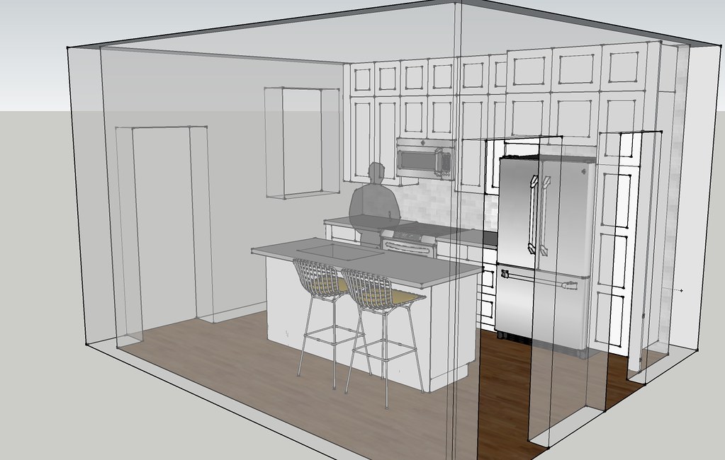
then i looked at a similar layout, only with an island so that we could walk around the entire space. in reality, this design didn't have very much storage and no added counter space.
i gave up on the window. i really really really wanted to have that additional window and natural light, esp. since the existing window is in great shape. but trying to work around the 3 doorways and the additional window was limiting the design. since i couldn't move the doorways, i decided to see what i would gain if i left the window covered. the layout above is similar to what we currently have. an added bonus is that we wouldn't have to do any major plumbing work since i was only slightly shifting the sink and dishwasher.
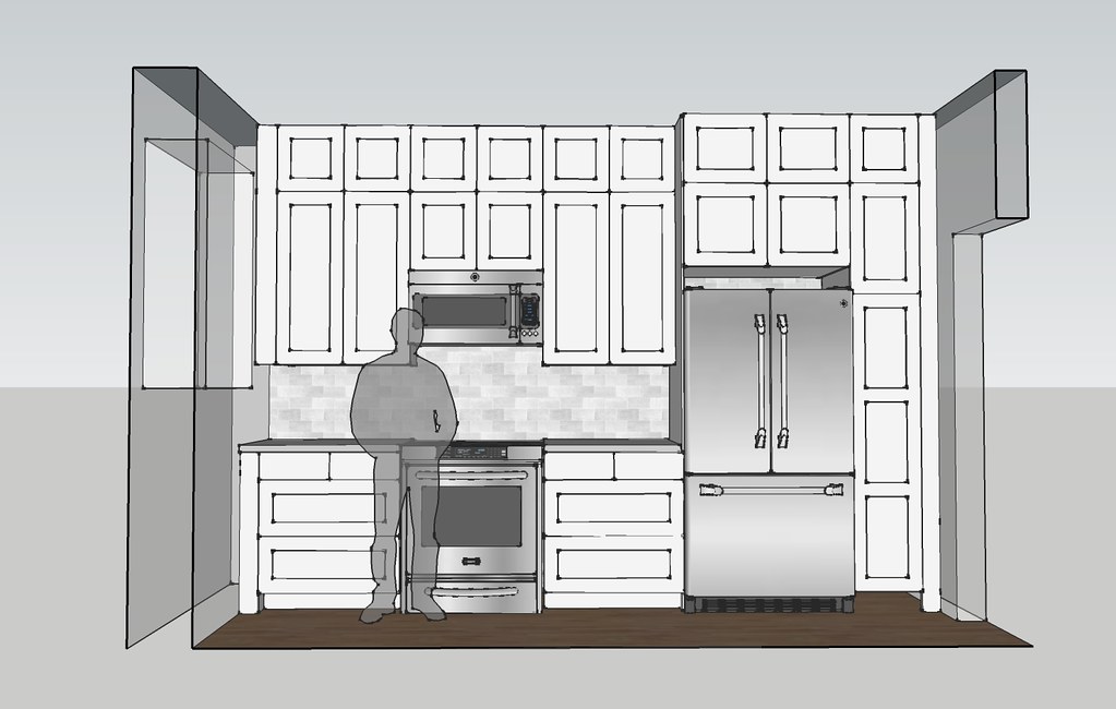
or maybe white cabinets all the way to the ceiling with a built-in island?
look at all of that storage!
then i combined a few ideas and tried to keep a similar layout to what we have now, only with more cabinets. at this point i also put the design in the ikea kitchen planner and started using standard ikea kitchen sizes. luckily, the standard sizes fit nicely in the space, but it's going to be a tight fit.
this is the design that i took with me on my initial ikea trip.
during that trip i learned that the door style i wanted was discontinued - and 70% off. the store had a limited selection of doors and drawer fronts left. they did not have enough of the small doors for the upper cabinets. so i did some re-design while at the store and come up with the plan below.
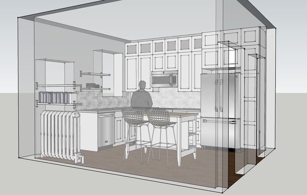
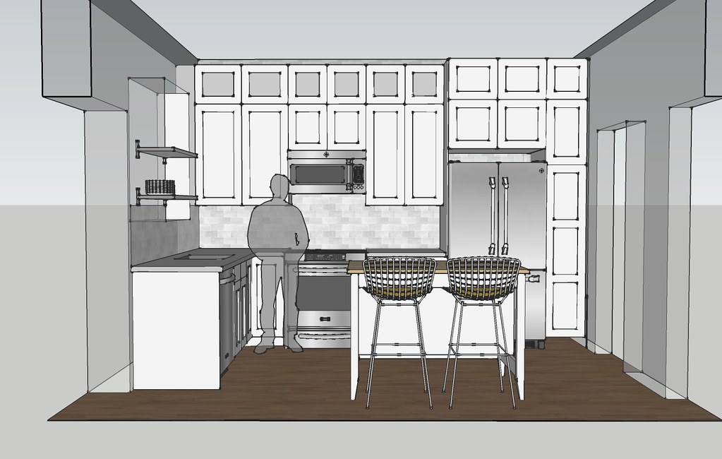
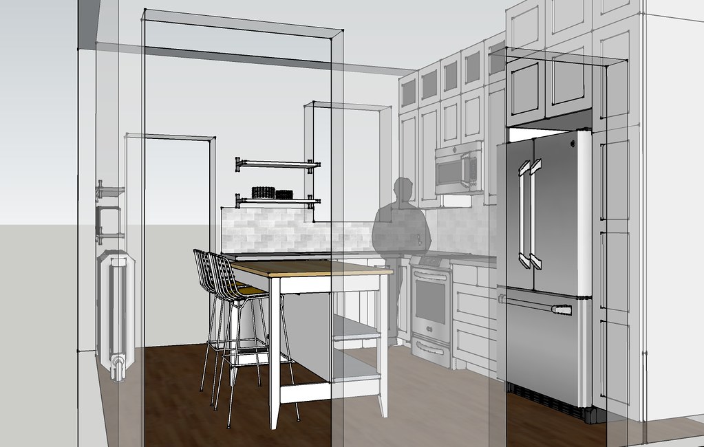
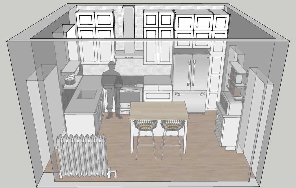
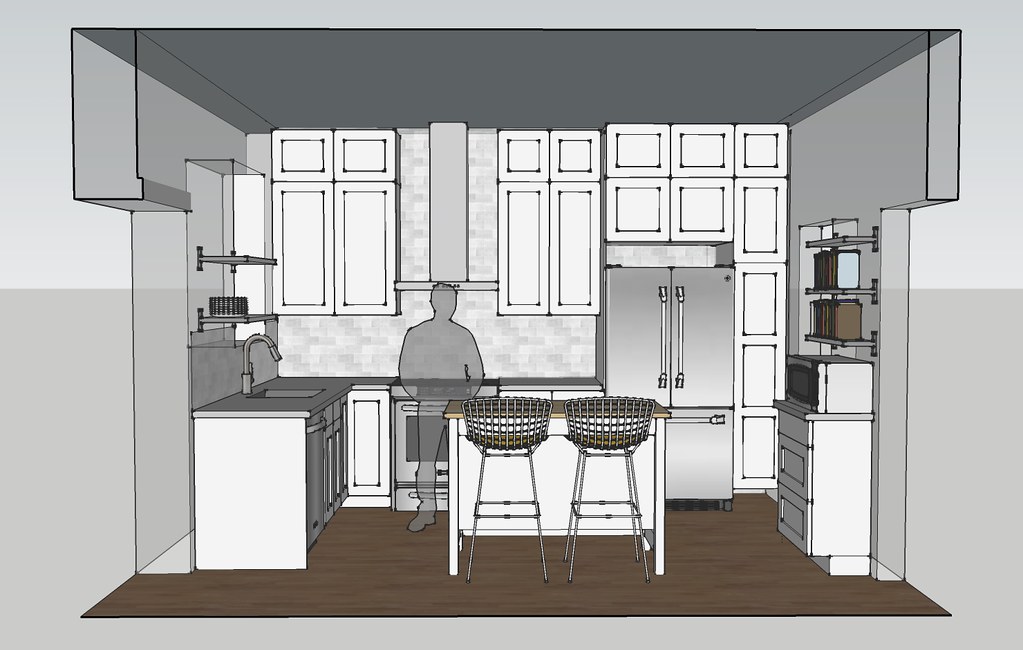
the range hood helps to break up with wall of cabinets. i have all of the door and drawer fronts for this design. at the time i thought that this would be the final design, but after thinking about it...
i've already made a few revisions. i think that i have the design finalized now and mike and i will be traveling to chicago soon to get the cabinet boxes.


6 Responses to the kitchen design
That looks like a fabulous layout! Even though I can't reach anything in my uppers, I still love that I can shove things up there at the ceiling :)
I really like your final plan! That's a huge amount of storage. The open shelving and range hood breaks it up nicely.
Very nice!
Really innovative and very useful blog you have created. I love the way you display sketch up models of kitchen design. Keep rocking.
Thanks so much for sharing!
Kitchen Cabinet Planner
Kitchen And Bath Contractors
Bathroom Remodel
Flooring Installation
Post a Comment