technically we are not done with the kitchen, but i am too excited to not share the 95% complete photos with you. i was hoping to have more time to post some of the details along the way, but i think now i'll just do those posts later. so if you have any specific questions, make sure to ask and i'll try to answer them!
as i've mentioned, the only big things we have left are finishing the base along the bottom of the cabinets, and eventually replacing or rebuilding the island. i'm still messing around with some of the accessories and details, and we'll probably end up installing some open shelving. but we've come a long way from where we started...
just for fun, here's the kitchen when we moved in:
dark, dirty cabinets, a fruit light fixture, wallpaper on the walls and ceiling, and green carpet.
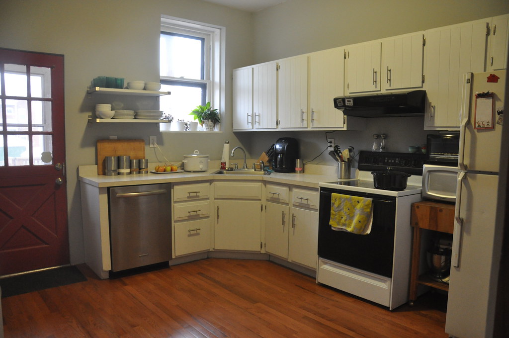
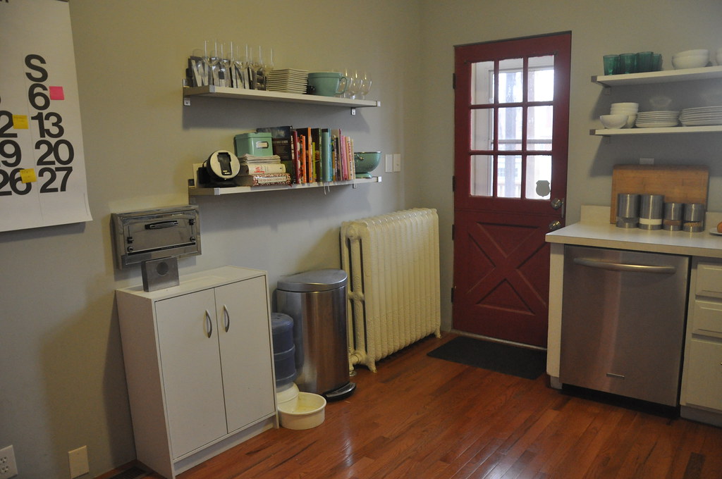
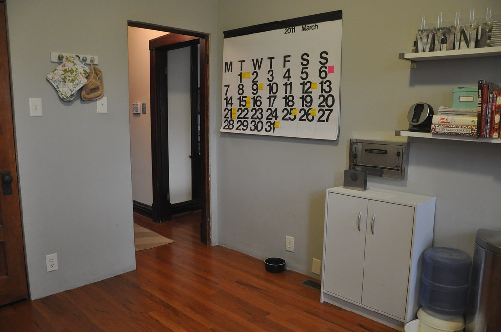
i think that living with the old kitchen for so long really helped us figure out what we needed in the new kitchen. we needed more storage and more counter space. as we've renovated the rest of the house, i've been mixing vintage ideas with simple modern elements, and i knew that i wanted something similar in the kitchen renovation. i also have a thing for unique light fixtures.
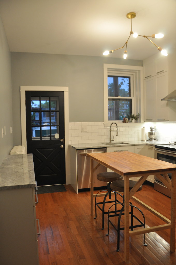
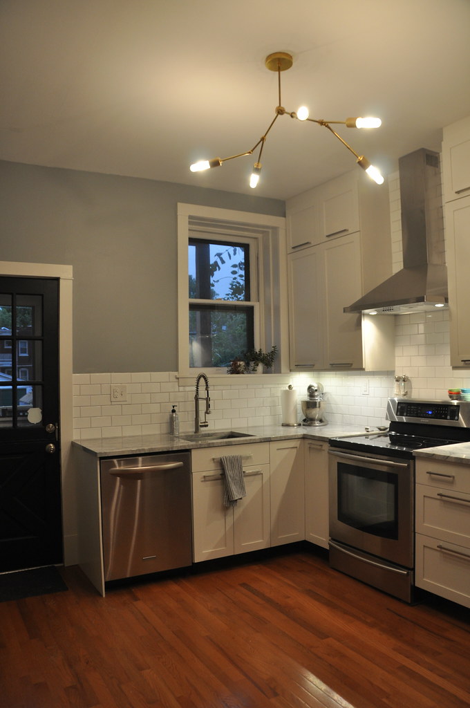
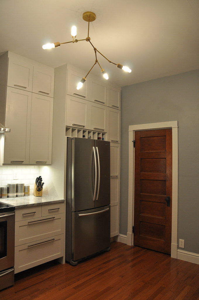
anyway, here is how the kitchen looks today (i removed the island in a few photos since the space is difficult to photograph):
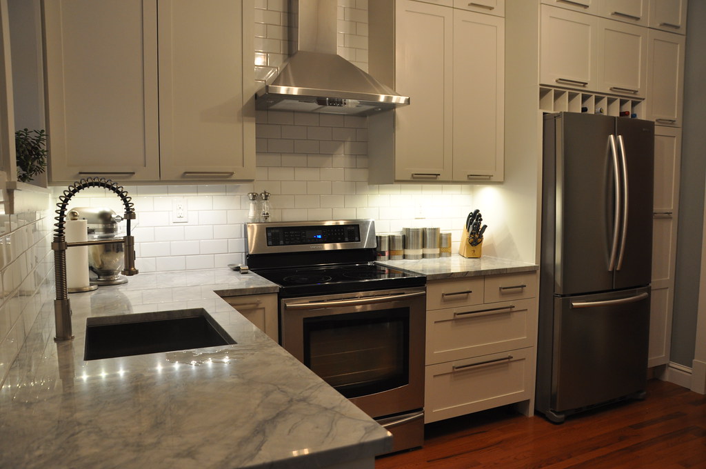

i will probably add some of the open shelving that we had in the previous kitchen above the microwave area, the kitchen seems out of balance and i think that will help. or maybe just hang my giant stendig calendar.
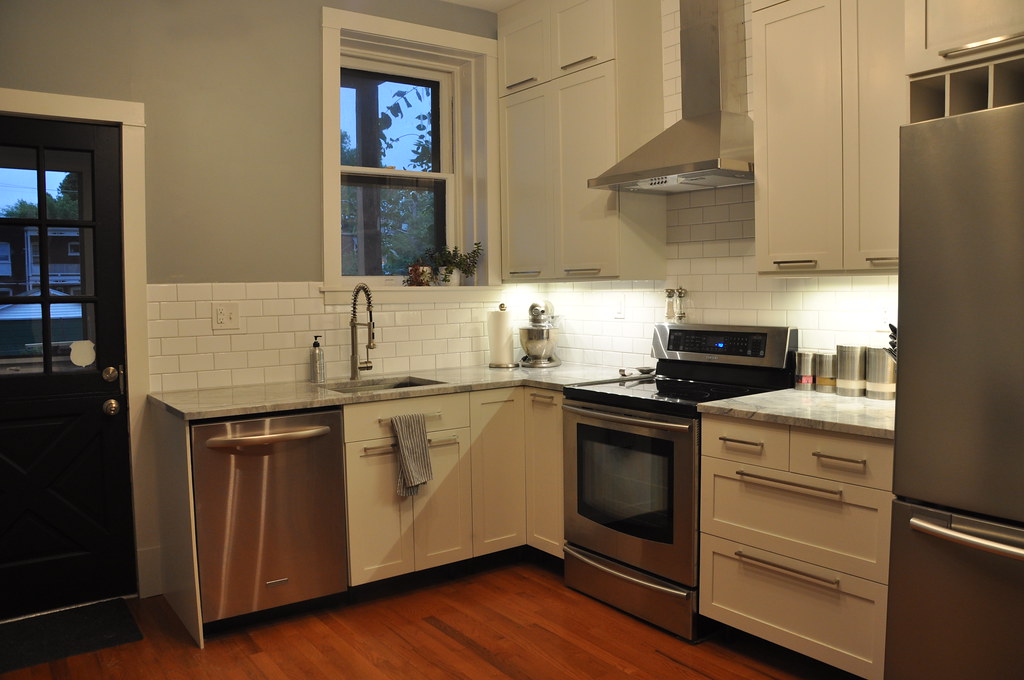
we really love it. it's hard to believe it's the same kitchen, the space feels so much bigger and brighter now!



11 Responses to kitchen reveal
Wow! What a fantastic job. I love the finishes you chose and the end result is absolutely gorgeous.
That light fixture is incredible. Great choice!
I love it! Gives me hope that we might actually finish our kitchen some day. Still need to order the IKEA cabinets, order counter, tile back splash, install sink and faucet. But since we took the kitchen down to the studs, rewired, added new plumbing, insulated, drywall, paint, tiled. It's practically the home stretch ;) I love the light too!
adore your light fixture & your calendar. Your whole kitchen seems so fresh & inviting!
I've been following your kitchen renovation the whole way and it's turned out great!! I'm also using IKEA cabinets, so I've been really curious about how you guys did that. And that Lindsey Adelman chandelier? So totally happening in my place. Nicely done!!
Wow, it is fabulous - and I am SOOO jealous of that light! Nicely done!!
this looks amazing great job, I agree that the kitchen looks so much bigger and brighter!!
BEAUTIFUL!
Your kitchen is perfect. It's exactly what I would love to do! And your light fixture fits in wonderfully. :)
Wow. It looks amazing. You have done such a great job designing and building your kitchen. I love it. The new design really highlights those high ceilings! And I adore the light fixture.
Such an amazing transformation! I love it. Nice work!
You HAVE to do a step by step post on making that Lindsey Adelman light! Please!!
It looks amazing! Nice work!
Post a Comment