

yesterday i went to lowes to buy a few flowers. i, of course, walked away with a few flowers, plus 6 different knobs to try out on the buffet.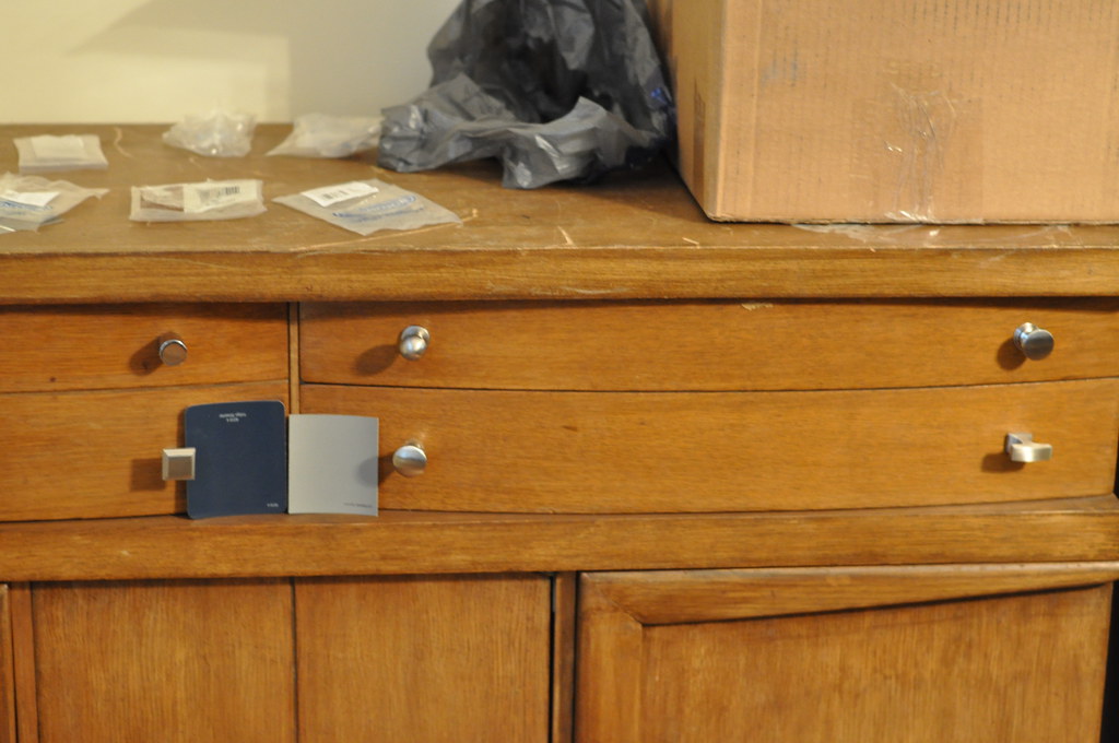
i'm leaning towards this gray color for the paint, so i tried to keep that in mind while looking at the knobs.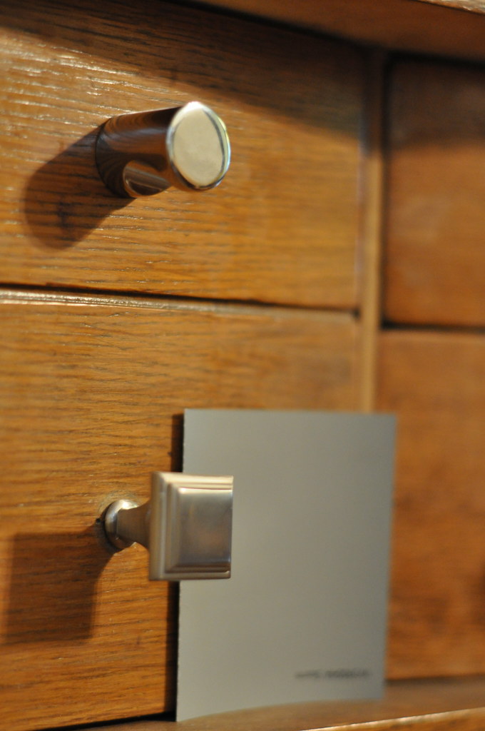
starting at the top, we'll call this options a and b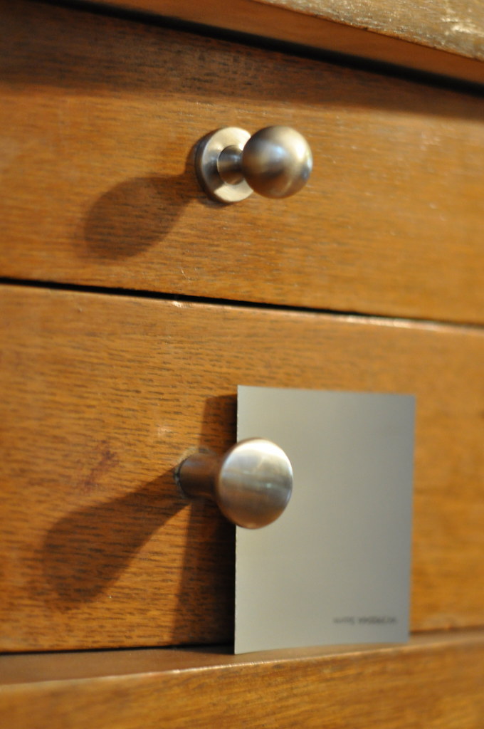
c and d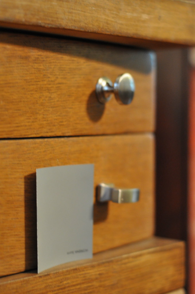
and e and f.
i'm liking options a, c, and d. mike doesn't like c, but i'll still keep it in the running.
it's raining here today so the plans of studying by the pool are out. i still need to study, but contemplating hardware options and trying to make a final decision on paint color seems like a lot more fun.
8 Responses to distraction
Out of those choices I like "d"
D for me too.
Love the grey paint.
Another vote for D as well!
I think I live in a constant state of distraction so I can totally understand this!
Oh, and I like d :).
i think "b" looks great - balances out the gentle curves.
interesting, i was really leaning towards "a" - guess i'll keep thinking about it!
Nice photo of you and Mike!
I love the grey. I vote for b, c and maybe f.
Post a Comment