2.5.12: started removing items from kitchen.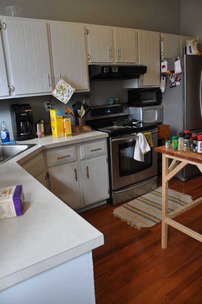
2.11.12: demo of cabinets begins, discover that we need to remove drywall.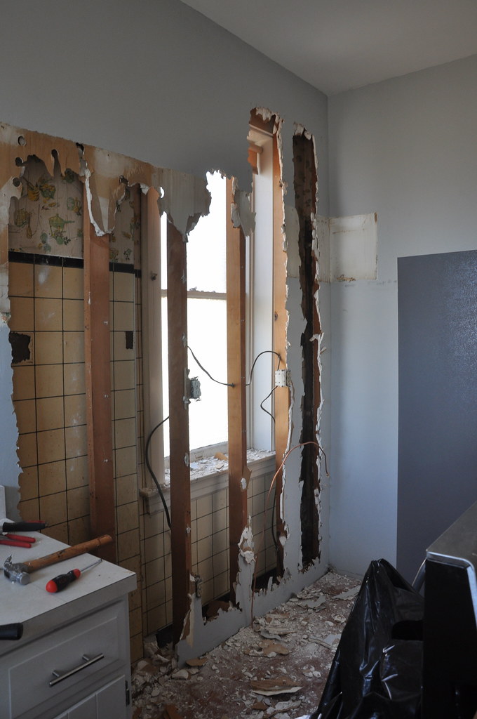
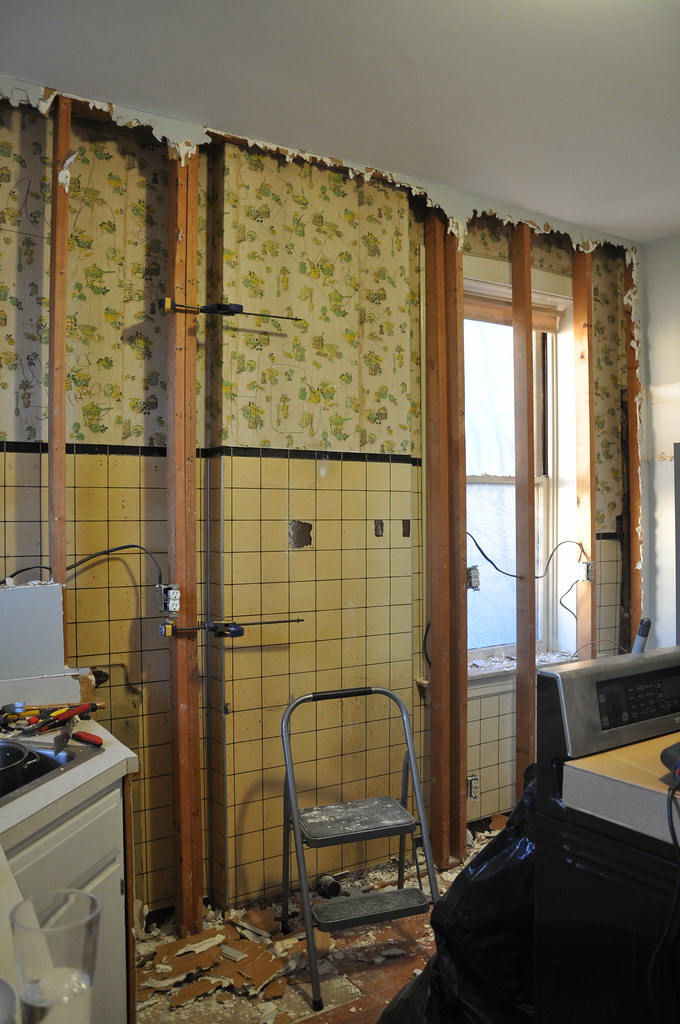
2.12.12: start to work on framing and electrical.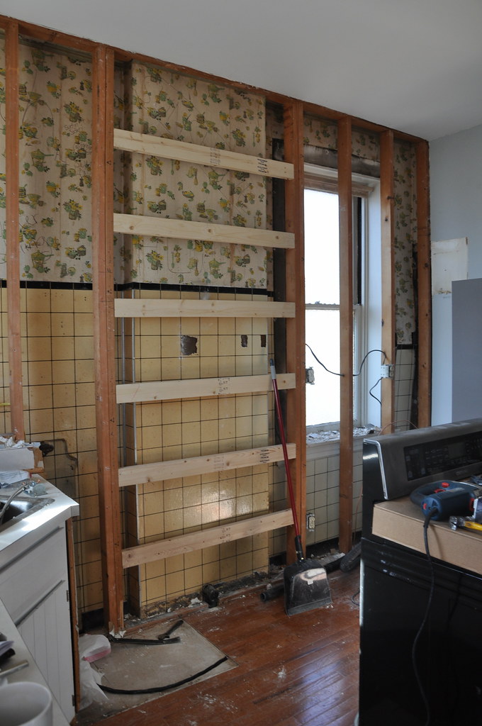
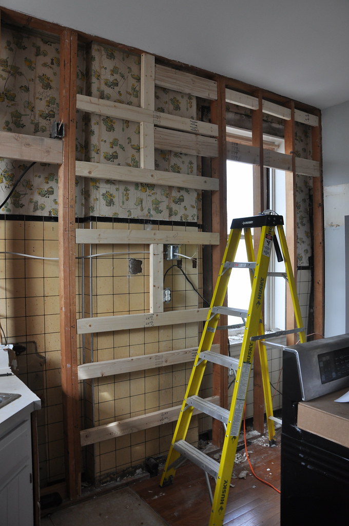
2.18.12: new drywall
2.19.12: install track for cabinets and start installing upper cabinets.
we need less work days and more weekends...
search
blogs i follow
-
1 day ago
-
2 days ago
-
1 week ago
-
1 week ago
-
2 weeks ago
-
3 weeks ago
-
3 months ago
-
3 months ago
-
1 year ago
-
2 years ago
-
2 years ago
-
2 years ago
-
3 years ago
-
3 years ago
-
3 years ago
-
5 years ago
-
5 years ago
-
6 years ago
-
6 years ago
-
6 years ago
-
6 years ago
-
6 years ago
-
6 years ago
-
7 years ago
-
7 years ago
-
8 years ago
-
8 years ago
-
9 years ago
-
9 years ago
-
9 years ago
-
9 years ago
-
9 years ago
-
9 years ago
-
10 years ago
-
10 years ago
-
10 years ago
-
10 years ago
-
10 years ago
-
10 years ago
-
11 years ago
-
11 years ago
-
11 years ago
-
12 years ago
-
13 years ago
-
-
-
-


6 Responses to here we go....
It's going to look so fantastic! Good progress so far. :)
Oh yeah, more weekends are a must. Too bad there are so many workdays in the middle!
I vote for more weekends too! Things are moving along in your kitchen. Looking good!
OK, pardon the drive-by comment, but what am I not understanding? What's with the wall-in-front-of-the-wall approach? Why not open the original wall? And is that an exterior window that has been (and will continue to be) covered over? I gotta admit, the drywall looks good, but this is one of the strangest things I've ever seen!
hi reuben!
yes, it is a wall in front of a wall. that is what was there before. i wanted so badly to uncover the exterior window, but the size and layout of the kitchen just didn't allow for it. i tried for 3 years to come with a design to make it work. in the end i decided i'd rather have a fully functioning kitchen. it should also be noted that the window itself was in bad shape and would have taken extensive repair to make it work. it also faces the neighbors house and a large tree. so in reality, except for a few months in the winter, it wouldn't really let in that much more natural light. it still bothers me, but i'm trying to justify it to myself :-)
as for the wall in front of the wall - i think that they did this to make the wall flush (you can see the bump out in the photo) to allow for easier cabinet installation. then they ran all of the electrical in the cavity. our exterior wall is brick. we talked about trying to remove the front wall, but in the end, decided it causes more problems than it was worth just to gain a few more inches of overall width.
not sure if that answered your questions... yes, it is strange and i wish it was different. but i'm quickly finding that with an old house and limited budget you have to pick your battles. anyway, thanks for stopping by!
ooooh exciting! **I couldn't find an email for you on your site or blogger profile so to answer your question about my tiles - we used 3x6! I would recommend it, I think it's the standard subway tile size.
Post a Comment