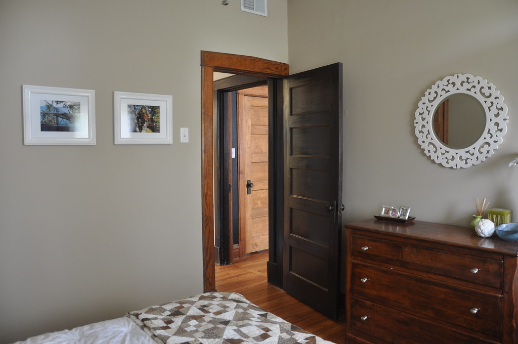
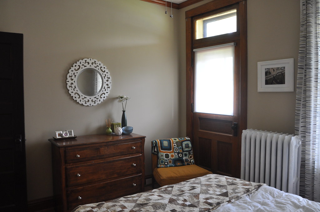
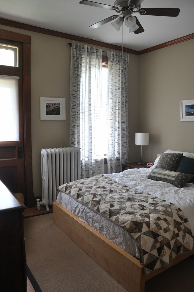
since the old guest room is now the baby's room, we had to move the guest room to the back of the house (the old office) - see floor plans here.
while i loved the dark blue wall color in the old guest room and briefly thought about repainting this room, in the end we decided to leave it the neutral color, and just move the furniture in to see how we liked it. i wasn't expecting much, but turns out i actually like this room better as the guest room. even though the rooms are the same size, this one seems like it has more space because we were able to rotate the bed 90*.


my goal for this room was to spend as little as possible because we were buying so many new things for the baby's room. in the end, we didn't end up spending anything, and were able to use furniture and accessories we already had. most of the items came from the old guest room, but the rug, curtains, and side table we pulled from other rooms in the house. i think it's a comfortable room and hopefully our guests will like it.
and just for fun, because this room has one of my favorite "before" house pictures, it's come a long way since this:


3 Responses to a new room for our guests
Love it! What is the name and brand of the wall color?
good question... it's sherwin williams, and i believe the color is whole wheat. we used sw antique white downstairs, and in the hallways, and i think i just went a shade or two darker on the same color swatch in this room. i can try to find the can if you'd like!
Love the before and after! Haha! That horrible wallpaper reminds me of one of the many layers of wallpaper that was on the walls of my room at my parents' house.
Post a Comment